When Star Wars Icons Go Flat (Design)
When Apple went for flat design for iOS 7, there were mixed reactions. I was – am – a fan of skeuomorphism, but I have to say I have somehow gotten used to flat design. There is something to be said about the simple lines and absence of drop shadows, but I do like a little more than that. But that’s all about iOS design in general.
Now, what if Star Wars icons were made following the principles of flat design? How would that look?
If you have a vivid imagination, then you probably already are seeing those flat Star Wars icons in your head, but luckily for everyone, artist Filipe Carvalho has created a set of flat Star Wars icons. Why don’t you take a look, and then let me know what you think.
Flat Star Wars Icons
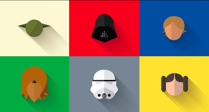
There’s no need to name each icon in this set, is there? I am no design expert, but I do think that while these icons look pretty good and are pretty much flat, they do not totally follow flat design. What do you think?
Here’s another set.
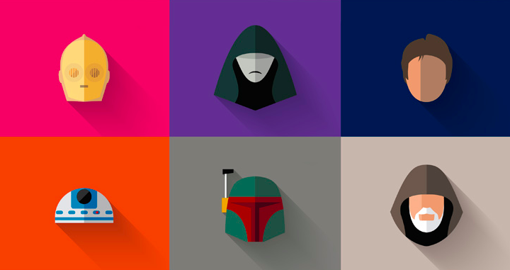
R2D2 and C3PO are looking really good, and this set might just be better than the first.
Obviously, I’m a Star Wars fan, so I wanted to pay a tribute to something I really love. Being a copywriter, the Star Wars’ universe that I was introduced to in my childhood has inspired me to create great and passionate stories that have the potential to capture the public’s eye and heart.
Do you think he accomplished his mission?
See all the images in high res here.